Originally published on GoshenCommons.org August 16, 2013
Welcome to the second installment of Commons Comics, a bi-weekly blog sponsored by Better World Books. Stay tuned for my first review—Chris Ware’s “Building Stories”—in the next post. If you’re already familiar with comics and you want some immediate reading suggestions, here are some of the other works released in the past year that I plan to review in the next few months: “Love in Yop City” by Marguerite Abouet, “Marble Season” by Gilbert Hernandez, “Relish” by Lucy Knisley and “March” by John Lewis.
Last week I promised an overview of five categories—moment, frame, image, word and flow—from Scott McCloud’s “Making Comics” (2006) to think about when you read comics. I also got requests from readers for more images, however, so I’ll slow down and start with just one of those five categories, the one that puts the “graphic” in graphic novels: image.
Perhaps the main reason that comics get dismissed as mere kids’ stuff is the simplicity of much of its art. McCloud argues in “Understanding Comics” (1993), however, that it’s precisely that simplicity that gives comics their power. Check out the contrast between these two images:
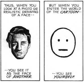
Which image are you more likely to listen to? McCloud asks. I’m not sure I completely buy his argument: he claims that we find simple drawings so compelling because we project ourselves into them. I do agree with him, however, that frame after frame of the guy on the left would exhaust my brain, whereas the “guy” on the right seems pretty genial. Not only could I listen to him for a while, but he looks like a pretty good listener himself.
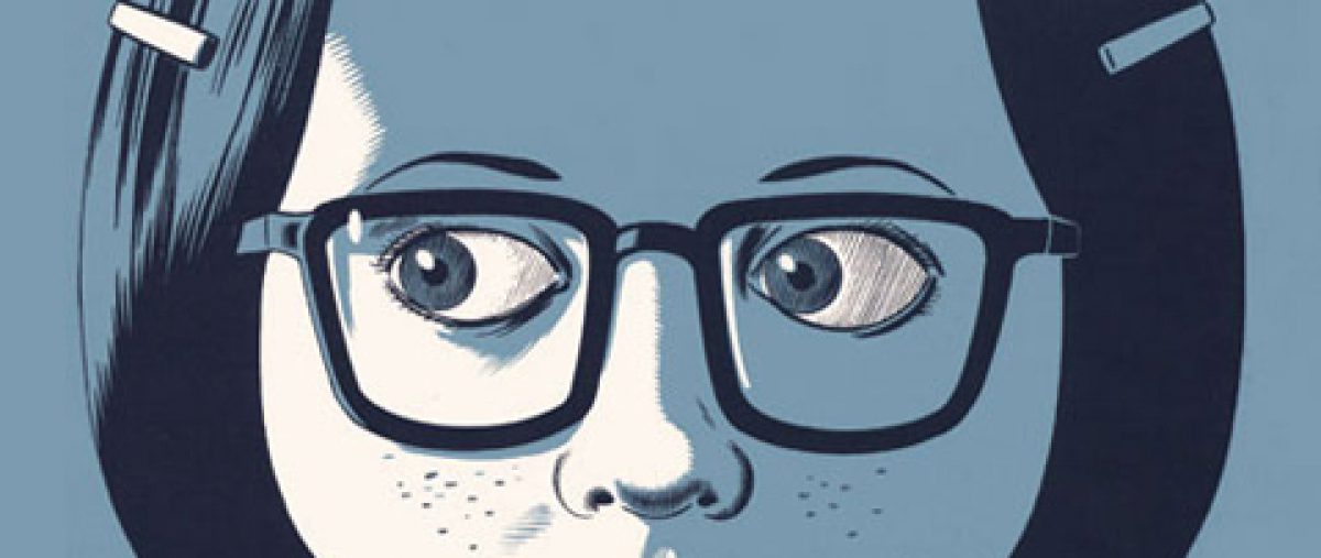
Those who don’t know the medium of comics often argue that Marjane Satrapi, creator of “Persepolis” (2003), is a “bad” artist. But what better way to convey a child growing up amid the Iranian Revolution than to present the story simply—quite literally in black and white? Here’s the first page of Chapter 6:
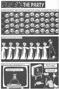
Similarly, in “Maus” (1986), witness the range of emotion Art Spiegelman can convey with the placement of just a couple of lines around his characters’ eyes. Follow the eyebrows on this page:
And just two lines below the eyes also convey emotional intensity—an exhaustion that doesn’t overexhaust a reader wary of a heavy topic like the trauma of Holocaust survivors in the U.S.
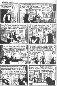
This isn’t to say that comics artists don’t use realism in their work—see Joe Sacco and Alison Bechdel, for example. Spiegelman often shifts gears into a more realistic style, and even inserts a few photographs, to mark important thematic points or major shifts in the storyline. But whatever you do, don’t underestimate this format just because it looks simple or unrealistic. Take a look at this section of “Building Stories,” for example:
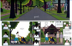
This half-page of Ware’s “book”—“book” is in quote marks because “Building Stories” is really a box of 14 small books, pamphlets, magazines and even what looks like a game board—that appears below the fold of the most newspaper-like of the pamphlets, seems simple enough. But look more carefully at what tiny lines—whether on faces, fabric, or porch slats—can accomplish to convey both emotion and significance. Ware’s bulbous characters stand out against the spare, straight-lined organization of their historic Chicago neighborhoods, and their puffy, unwieldy bodies speak of likewise unwieldy, disorganized and often despairing lives. I again return to McCloud’s argument that comics, more than just words plus pictures, speak to their readers on multiple levels at the same time. In this case, Ware’s unique use of the medium of comics makes the reading experience visceral rather than simply visual. More on that in next week’s review of Ware’s book. In the meantime, thanks again to Better World Books, and keep the comments coming.